
Chu.IX

Interactive Impact Map
Contributing Creatives
Annia Pavli,
Emma Smith,
Natasha Martin.
My Role
UX/UI Design, Prototyping,
Team member.
Apps Used
Collaboration with Partners in Health Canada
Focus
UX/UI Design, Interaction Design,
Storytelling,
Social Impact.
SketchUp
Illustrator
Google My Maps
Overview
As part of the 2025 Winter semester at George Brown College, I worked with a team to design digital solutions for Partners in Health Canada (PIHC). Our goal was to make their global impact visible and engaging to bring trust and donors to their page. We conducted market research and surveys, collecting data to build our final prototype. To fit the non-profit's specific needs, our team divided into workflows to create both a budget-friendly alternative and a "Stylized Impact Map"—a high-fidelity Figma prototype demonstrating a premium, brand-aligned user experience, which was my primary focus.
Problem
Despite PIHC's extensive reach, its impact wasn't immediately clear to potential donors. Through our research with users aged 18–34, we identified that this demographic struggled to find clarity and storytelling in the current donation experience. The challenge was to bridge the gap between abstract funding requests and the tangible, human impact of their work.
Our Process
To establish a clear understanding of the project, we worked closely with PIHC through a series of collaborative meetings that helped us learn about their mission, audience expectations, and organizational challenges. We complemented these conversations with a review of their campaign materials, brand guidelines, and internal data to understand the current communication landscape.
Alongside this research, we conducted surveys and usability testing with participants aged 18–34, which revealed key gaps in clarity, storytelling, and the donation journey. These findings guided our approach, highlighting the need for transparent impact metrics and a more human-centered narrative throughout the digital experience.

.png)
The Solution
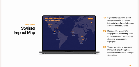
I co-developed the Stylized direction, which centred on humanizing the data and bringing donor impact to life. Our team designed a zoomable, interactive map spanning 11 global locations, blending key metrics with genuine patient stories to create a more emotionally engaging experience. This concept illustrated how a future, premium interface could build donor confidence through greater transparency.
We also developed a second solution—an interactive map built using Google My Maps—to offer PIHC a more budget-friendly and immediately implementable option. This version aligned with their technical and financial constraints and ultimately inspired the approach they adopted for their website.
Research Insights

.png)

.png)
Final 3D Mockups
.png)
